Instagram is a platform where visual content plays a crucial role. Despite the fact that today Instagram is not an art gallery or a photo album, still, the first thing that we pay attention to is a posted image itself.
But if you are interested in promoting your page, I strongly recommend you to take care not only about your posts separately but to perceive your account as the whole.
I want to warn you: after you post your pics, you won’t have a possibility to rearrange them. That’s why it’s necessary to have a clear understanding of the concept of your account. If you want to find Instagram account design inspiration, read the post till the end!
Why you should follow Instagram design trends in arranging your account?
You may take really amazing photos, use filters, add captions but they can just get lost in your account if there is full chaos there. In order to reach harmony, I advise you to follow Instagram design trends 2022 and use some Instagram grid layout ideas to make your account look breathtaking.I think that you remember the main principles of Instagram promotion. Seeing your posts that you should try to make popular your potential followers visit your account. And based on the impression that it makes they will take a decision on whether they want to follow you. It’s unlikely that before starting to follow you, a person will carefully study all the posts that you’ve published before (especially, if there are already more than 100 publications in your acc). Maybe he or she will open just a couple of them and if he or she considers them to be interesting, the number of your followers will increase.
But not only the quality of your posts will be an influencing factor. A visitor always looks at your bio (yes, it’s quite natural that a person should know in what way you position yourself) and at the general layout of your pics (as it helps to understand your attitude to your account and the seriousness of your approach). But now we won’t speak about the first component (in case you need fresh ideas what to write in your bio and how to win the attention of Instagram users in the first seconds, our article with Instagram Bio Tricks + Funny Instagram Bios for Your Inspiration! can be of great use for you). I like observing trends for your Instagram account design inspiration, so I will be glad to help you, me reader!
Now we will speak in details about the variants of layouts. However, before we proceed to concrete samples and their analysis let’s understand whether you really need to spend your valuable time on it.
Of course, there are millions of accounts the owners of which have never even tried to organize their posts in any peculiar way. But the majority of these inflacts do not have an aim to promote their accounts and achieve the top, they just use the app to share their photos with friends or just to keep their pics and videos on the platform instead of storing them in the memory of their mobile devices.
Nevertheless, if you want to make your account popular you should clearly realize that you need to put a little bit (okay, let’s admit, much more) efforts and time in managing your account than these above-mentioned millions of other users.
Why I recommend to layout your Instagram feed:
- a well-structured account looks catchy;
- a good organization of your content helps users to better understand its concept;
- in some cases, a layout may be useful for navigation.
Instagram design trends 2022: how to make your Instagram look good?
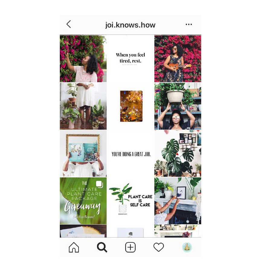
Just look at this account. Do you like it? Is it pleasant for you to look at it? How to make your instagram look good? If you think that you need to be a cool experienced designer to run an account in such a way, you can breathe with a sigh of relief. It’s not true. Even without any specific professional skills in design, you will be able to create something like that (or even better).
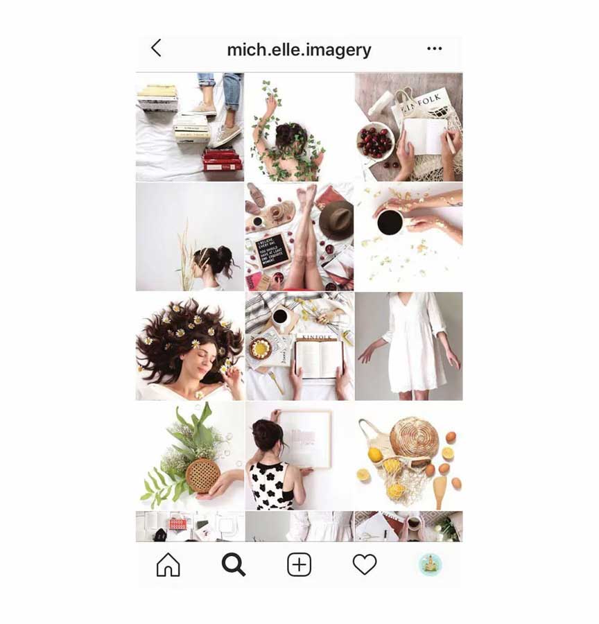
In our blog, you can find a general overview of 7 trends to customize your Instagram profile. Among the others, there are a couple of them that represents for us a very special interest.
They are colors and forms. In general, now we will speak mostly about them.
How to make your instagram feed look good? My tasks are the following ones:
- to show you how you can use colors and forms in creating your profile layout;
- to explain how to choose the functional layout based on the specificity of your account;
- to convince you that following top trends on Instagram is not so challenging as you may think.
Variant 1. Checkerboard
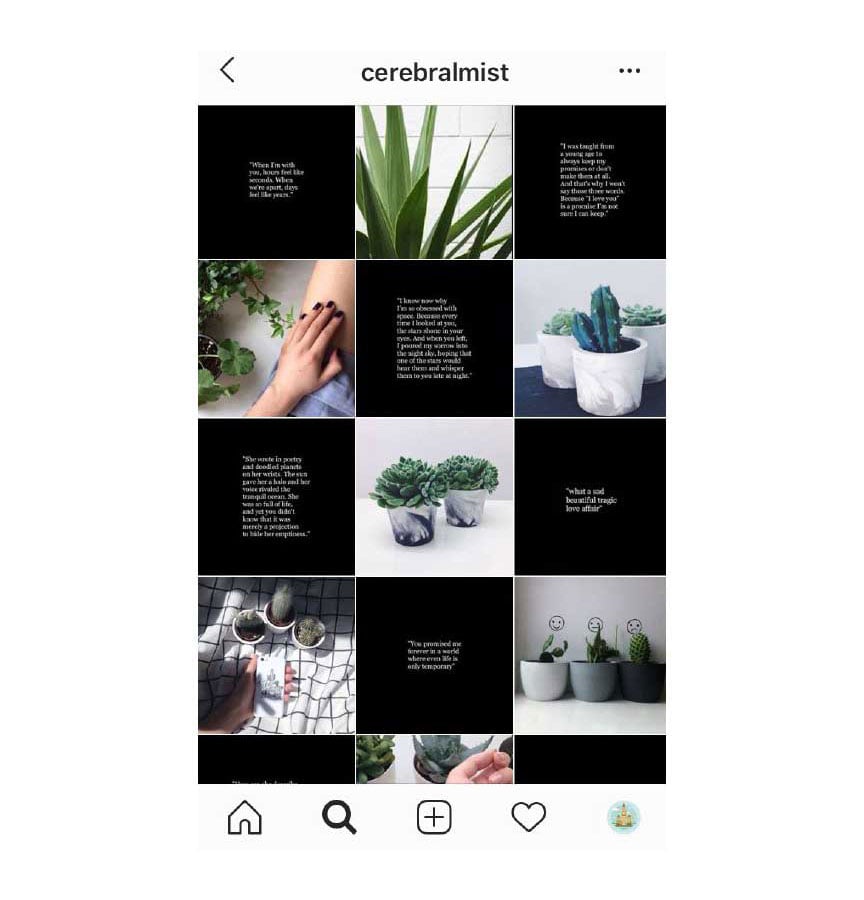
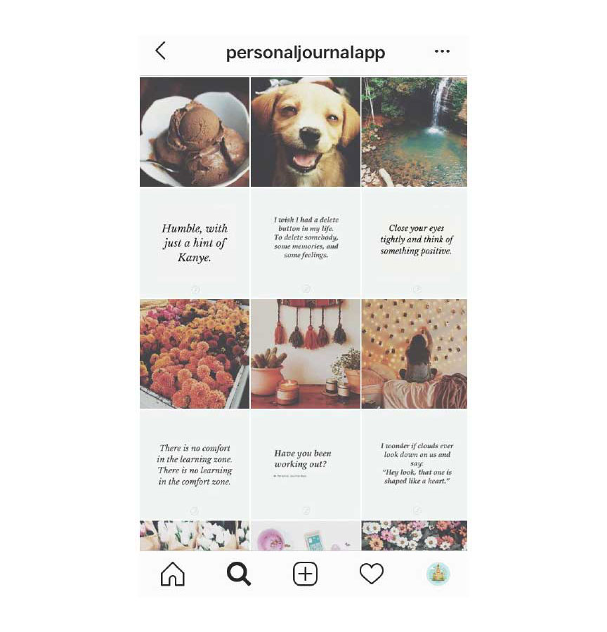
There are a great variety of different ways to arrange your posts but a so-called checkerboard feed enjoys very high popularity and is definitely one of the Instagram design trends today.
What should you do?
You should alternate two types of posts (or posts of two different colors). It doesn’t mean that you need to use only white and black (though it’s also possible). Quite often you can see a variant of a checkerboard feed when users published a photo than an image with a quote, then once again a photo and then a quote and so on.
When is it appropriate?
Such a variant of a layout can be used practically in any case. If you are running a commercial account and offer some goods you can alternate images of your products with some useful posts with tips, recommendations, to-do lists, and other interesting information.
If you have a private blog, you can publish your own photos followed with some interesting quotes with your thoughts in captions.
There are a lot of variants. How to make your instagram feed look good? Nevertheless, the idea is always the same. Just try it out. It is unexpectedly easy to do it.
Variant 2. Horizontal Lines
What should you do?You should post three somehow united photos one by one. It can be photos of a similar color, showing the same places or telling one story. Or all these three photos should be parts of one image.
When is it appropriate?
Though many bloggers use this type of layout just because it is really attractive from an aesthetical point of view, I recommend you to enjoy all the benefits of this type of account arrangement. It could be a great idea to use the consequence of three photos to tell one common story. For example, you can imagine that one row is one article just like those that are published in magazines and divide the story that you want to tell in three parts. The best variant is when all these parts separately can be viewed as a short finalized story as well.
Though in general, this type of layout has an impressive amount of advantages for you and for your followers, there is one disadvantage. But okay, let’s better say that it is a peculiarity: you need to post all three posts of each line practically simultaneously, just one by one. Unless you do it, your beautiful layout will be ruined. That’s why each time preparing for publishing your content, you should have three posts fully ready to be seen by your existing and future followers.
Variant 3. Vertical lines
What should you do?If you don’t like horizontal lines, you can opt for vertical ones. The idea itself is very close. You need to create lines of posts based on their color, theme, idea, etc. But to tell the truth, this variant of a layout is a more challenging thing, I should admit. If in the first option, you just create a line of posts and then proceed to a new story, now you need to bear in mind three visual stories=lines and to be very attentive in following the right consequence. Just as in the previous case, you should publish three posts (in this very case, posts of different types) in order not to spoil the overall image of your account.
When is it appropriate?
Such a layout can be a good idea not only for commercial accounts but for private as well. By the way, you can create only one line of posts (in the middle) while the posts located on the sides can be not united by the same story. Though it can be easier, it still won’t help you to avoid posting three publications at the same time.
For example, you can create a line of quotes, or interesting facts about your services, or secrets of manufacturing your products. The range of variants is limited only by your own imagination.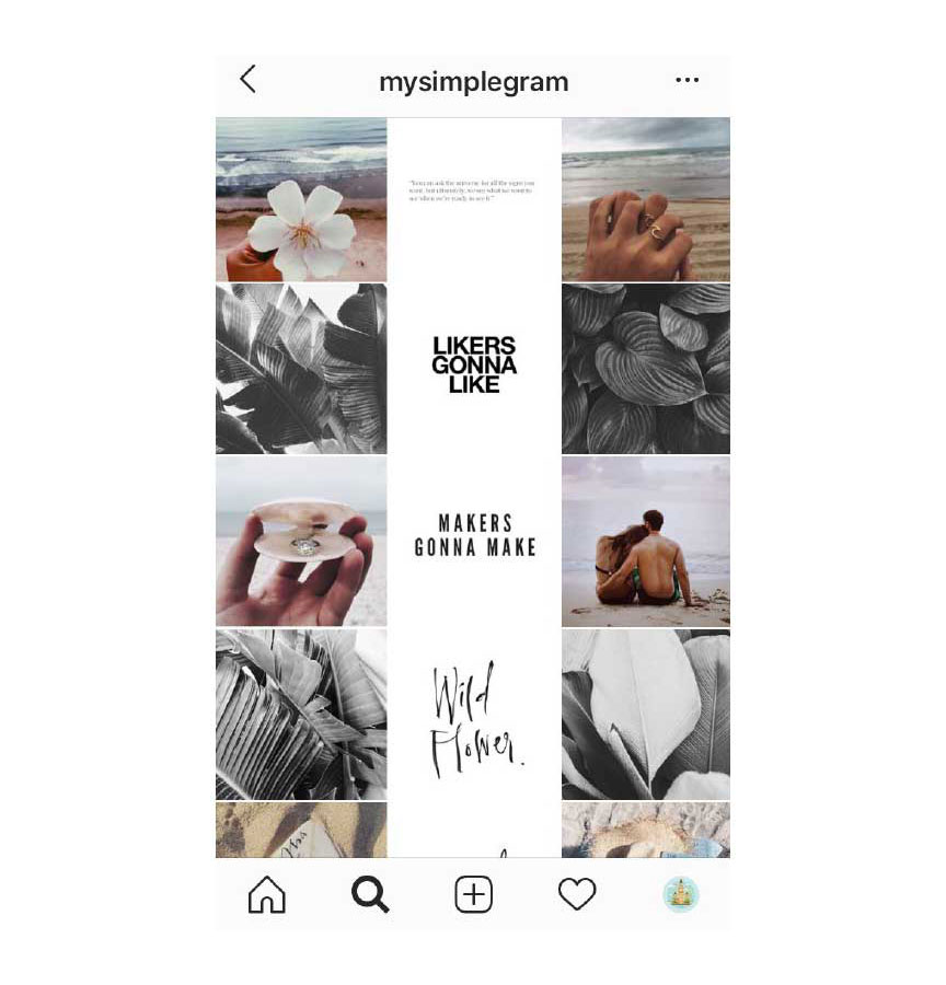
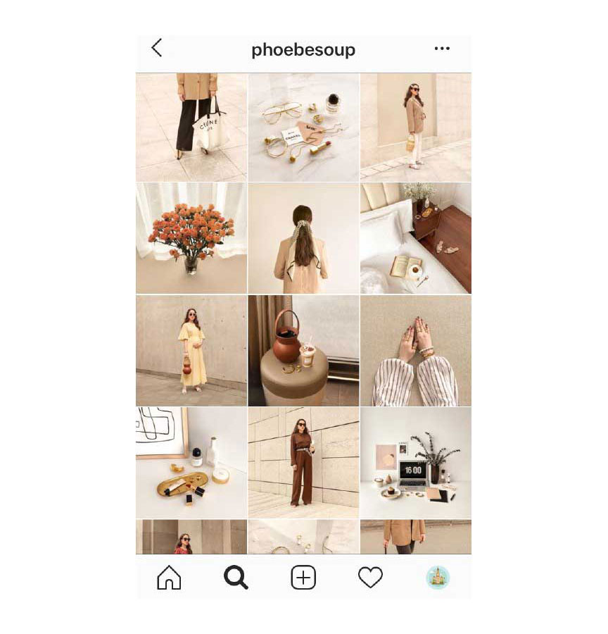
Variant 4. Diagonal Grid
What should you do?As you may have already guessed from the name of this layout, the concept of it is very similar to the above-mentioned ones. But this time your task is to create diagonal lines, not horizontal or vertical ones. Maybe it could be more difficult to create such a feed but only because of the necessity to be extremely careful in planning your future posts.
When is it appropriate?
Very often this type of posts arrangement is used by fashion designers and shops as it helps to highlight details and to show overall plans at the same time.
Variant 5. Puzzle Layout
What should you do?The main thing that should be done is splitting a large single image into multiple ones and publishing them as individual posts.
The easiest way to create such a layout you can take an image an split it in 9 or 12 parts.
But the idea is to treat each image as a separate post but at the same time to bear in mind that it should create a part of a large single image. Given this specificity, you should pay attention that each image should meet all the requirements for Instagram posts, otherwise your followers won’t understand why you have posted at in general when they will see it in your newsfeed.
When is it appropriate?
Frankly speaking, lifestyle bloggers don't use this variant of arranging their photos quite often but namely, this puzzle layout can be the best and widely applied Instagram trends among those who need to create a landing page.
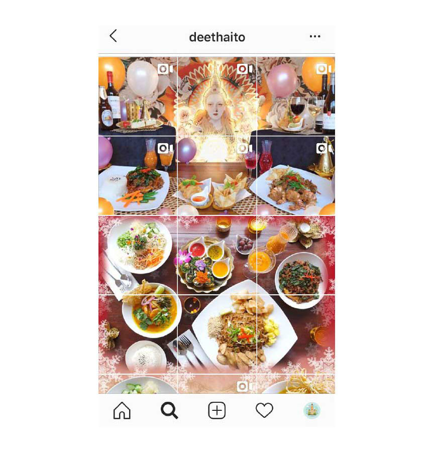
Variant 6. Collage Grid
What should you do?In general, this idea is rather close to the idea of creating a puzzle. But in the case with a puzzle, you need to take one pic and split it into multiple pieces. In this case, your posts can be rather different but they should have some elements that will make all your publications interconnected. Once again, all your posts should be perceived as separate publications but all together that should be united in one collage. To tell the truth, when I see such accounts, it’s really very difficult for me to stop scrolling, as sometimes people really have unlimited phantasy and it’s really cool to see what they can create.
When is it appropriate?
Such an approach could be a cool idea practically in every case but I should admit that to create this layout can be a rather challenging job. Moreover, it is necessary to have at least the most general understanding of some photo editors such as Adobe Photoshop.
Maybe you will need to spend some time learning how to work with these programs and even more time on making up an idea. But I promise you, your efforts will bring you fruits.
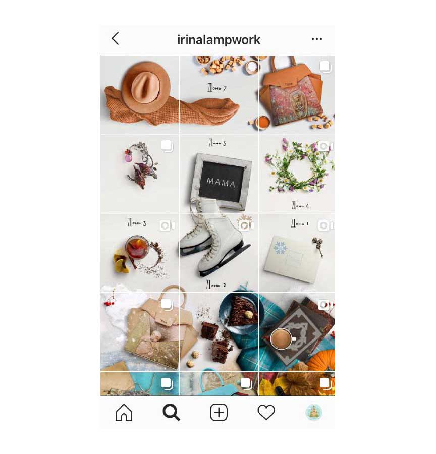
Variant 7. Borders
One of other very attractive and catchy Instagram design trends is using borders. Yes, it’s really a very easy-to-use idea. It doesn’t require much efforts and time from you but results look very impressive. Vice versa, it will even help you to save your time. You won’t need to opt for a visual aesthetic each time you are going to make a post. You just need to stick to one style and use one type of borders.
What should you do?
The main task for you is to choose what color of borders you like. You can use white, black borders or borders of other colors. But be sure that these borders really suit the images that you post.
To add borders, you can use any of the apps available. There are dozens of them and to add borders via them you need to spend just a couple of minutes.
If you want, you can also use the same filter for all your photos to make them look absolutely harmonious. With white borders, I advise you to use some vintage filters.
When is it appropriate?
Based on my experience, I can say that borders are quite often used by bloggers as it is really easy to use them and they don’t need to spend hours editing their pics. But at the same time if you are running a business acc, why not to try it as well?
By the way, if you are afraid that borders will make your photos look just the same, don’t worry! You can use different sizes and shapes of borders and mix them how you wish. Add square, rectangular, round borders and do not hesitate to use other new things. You are free to do what you want.
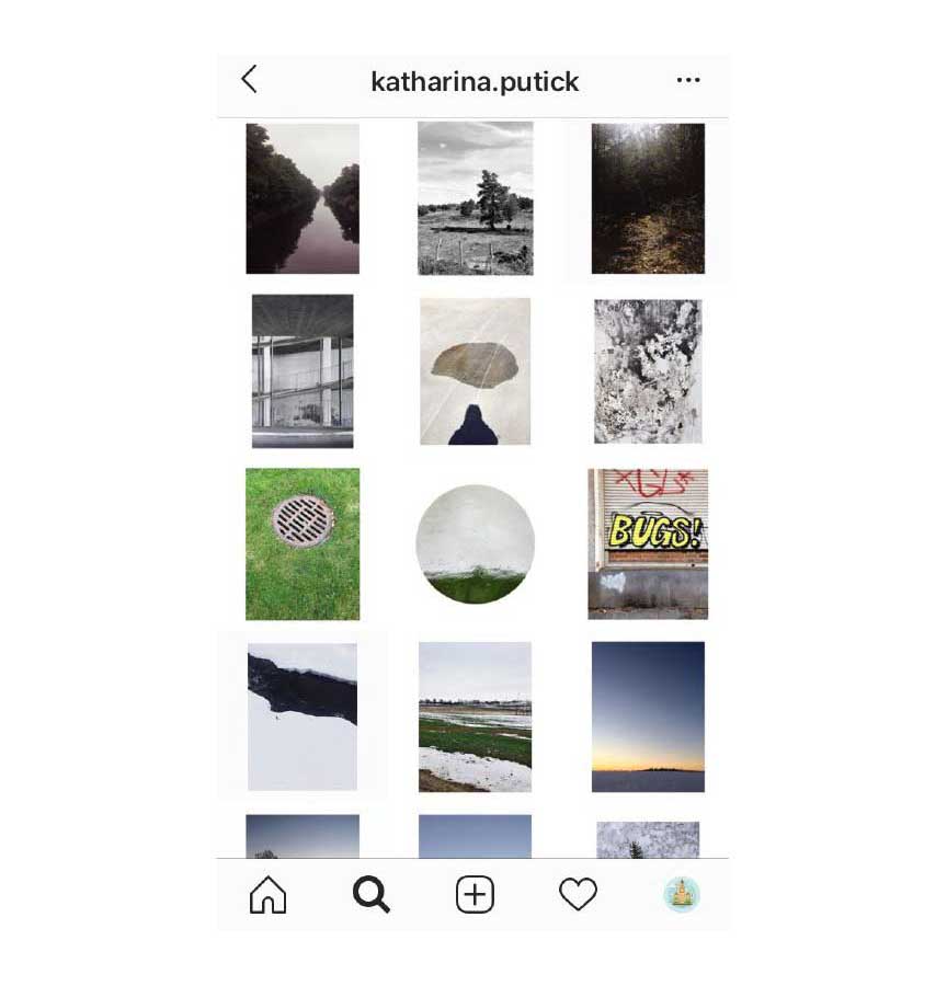
Variant 8. Basic color
I am sure that you have heard about the role of colors in the design, there are even a lot of rules on how to combine them and how to use these combinations. Nevertheless, when it comes to Instagram trends, we usually pay more attention not to the meaning of these colors but to the authentic aspect.
Though black and white accounts always look pretty good, they can be too boring if you are trying to promote your brand or when you are a young mum trying to reveal all the secrets of starting this journey. Don’t forget that the visual style that you choose for your acc should be compatible with your own image that you are building.
What should you do?
You should choose a color (or two) that will unite all your pics. In case you are running a business account and your company has corporate colors, you are lucky, as you can use them. But even if don’t have any colors that your brand is associated with, it’s not a disaster.
When is it appropriate?
Though I have just mentioned that the task of choosing variants can be much easier for commercial accounts with corporate colors, maybe in some cases the usage of just one color or two can be a little bit boring for a business account. Nevertheless, there are no strict rules on whether business account managers can use this idea or not in creating accounts for their brands. If you like this idea and it corresponds to the philosophy of your brand you can try it out.
By the way, many bloggers use a rainbow feed. What does it mean? It means that they choose one color for every 6 or 9 posts and then change the color trying to make the transition from one color to another as mild as possible. It’s really beautiful when the shade is slightly changing from one photo to another within these 9 photos of one color making you believe that it’s a real rainbow, not just an Instagram account.
But you should be ready that playing with these colors is not the easiest task. Nevertheless, it’s worth it. It’s impossible to avert your eyes from these rainbow accounts.
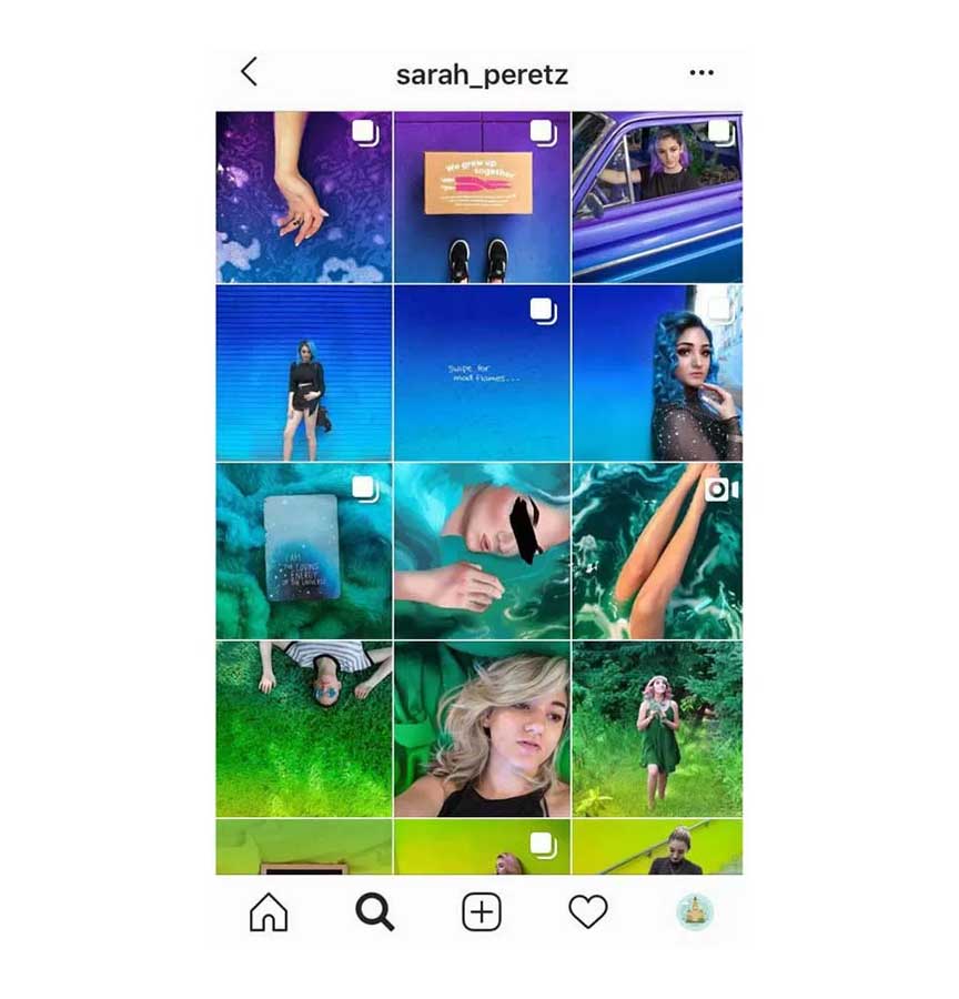
Variant 9. One filter
What should you do?Maybe it’s one of the simplest ideas that I am sharing with you. Partially, I’ve explained it in the section about borders. But why have I decided to speak about it in a separate block? First of all, because despite the fact that it is the easiest approach to making your account look amazing. And secondly, it’s absolutely logical to mention this method just after we have spoken about the usage of a basic color.
It‘s not always possible to use one color. For example, if you are a travel blogger, a photographer or an Instagram model, it’s not very likely that you would prefer to share photos in one color only (moreover, it’s not very likely that you will even always have a possibility to stick to one color even in 2 or 3 consequent publications), that’s why I offer you another option.
You can post whatever you want but you need to use the same settings while editing your pics or to use one filter for your photos. The second variant that presupposes using filters is even easier as you can use in-built Instagram filters which requires to spend only a couple of seconds on it. That’s why don’t worry that it could take you long hours to edit all your pics simultaneously.
When is it appropriate?
This variant is appropriate for absolutely all types of accounts. There are no limitations at all.
To use one filter is an amazingly easy task but the results will go beyond all your expectations. With the help of one filter, all your posts will look like an integral system united by one mood and common shades.
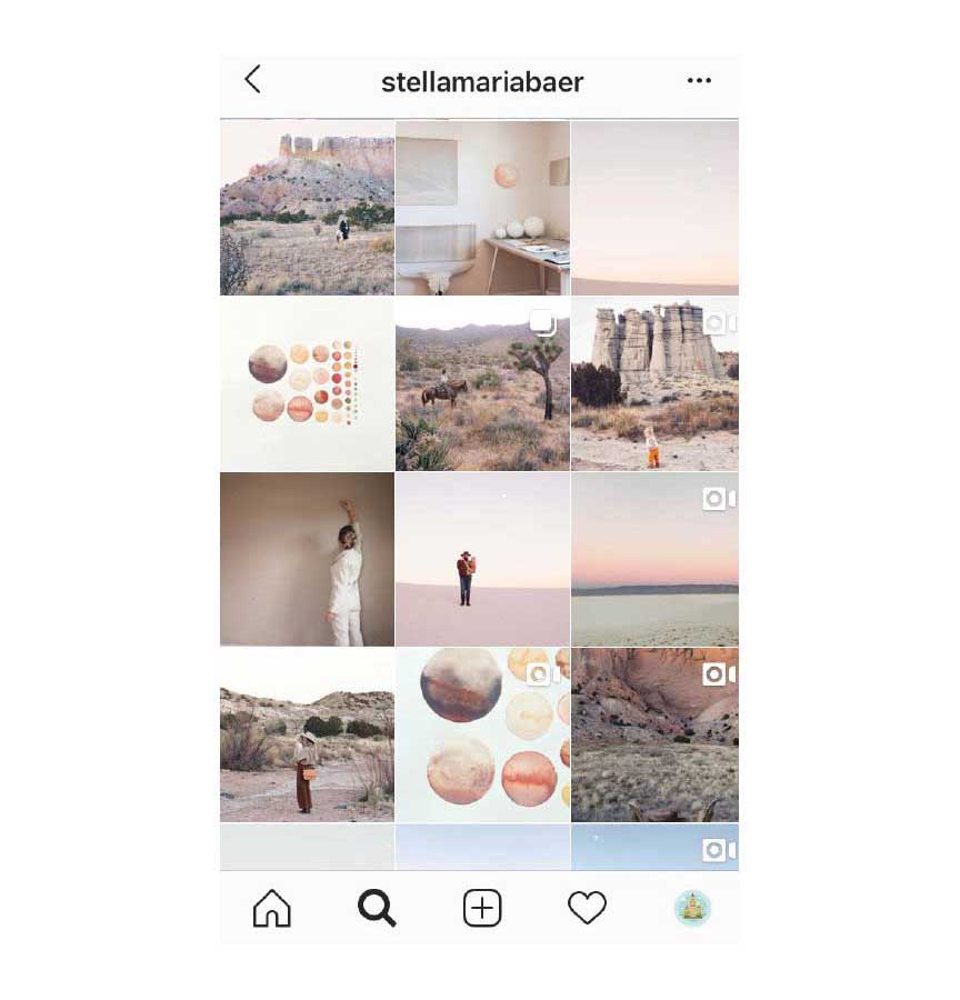
Variant 10. Single angle and concept of shots
What should you do?Do you remember these “follow me” photos that were so popular a couple of years ago? Some bloggers were so inspired by this idea that all their photos were made in accordance with this concept. And you know what? It looks unbelievably eye-catching. I don’t try to persuade you to make dozens of “follow me” photos and post them just one by one, I want to inspire you to seek for an idea that can be close to you and that will correspond to the general idea of your account.
For example, if you are a food blogger and you publish your recipes, you can use the same plates and other kitchen stuff for your pics as well as the same angle. It will make all your posts be united with the same idea.
When is it appropriate?
Unfortunately, despite the fact that I really like this variant, I should admit that it won't be suitable for everyone. Or maybe I just don’t have enough imagination. For example, I clearly understand how a food or travel blogger, a shop or a beauty salon can use this idea but for me, it’s difficult to imagine how a fitness model will translate this idea into life. Nevertheless, it doesn’t mean that it is forbidden to try.
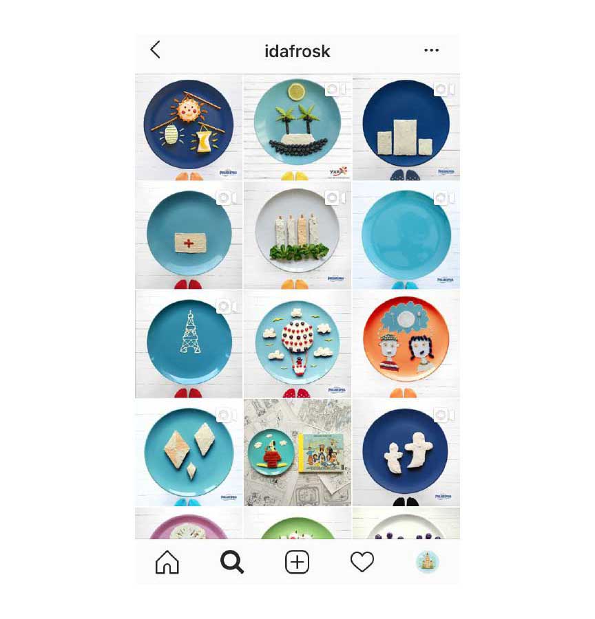
Variant 11. Single style
What should you do?Some accounts are presented in one style: comics, doodlings, photos made in the style of pop art or minimalism. It looks really breathtaking but you need to understand that to start running an account in this style, you should have enough content and enough ideas on how to continue creating your content in one style. Otherwise, you will get a mixture of styles but it is already a different approach ;)
When is it appropriate?
I need to admit that this option can be useful only for those bloggers/ photographers/ designers who clearly understand how they want to present themselves to their audience and who clearly understand how to reach this goal. If you are not sure whether you will have enough content that meets your own requirements of one style, maybe it’s better to leave this concept aside. Yes, to leave it aside at least until the moment when you will get more understanding of the type of content that you have and your own vision of it.
Very often designers, artists, and illustrators with their own well-established style successfully use this approach.

Variant 12. Sophisticated combination
What should you do?You need just to combine all the ideas that you’ve just read about and enjoy the process. Yes, this variant offers you an incredible amount of freedom. But to combine all these ideas in one is a real art itself and it is not so easy as it may seem.
When I say a “sophisticated combination” I don’t mean that you should post all your photos just randomly. You still have to stick to some concrete principles. For example, you can post a line of publications with borders, the second line can represent photos united by one concept, the following row can contain pics of one color, then you can make 2-3 rows arranged like a checkerboard. You can try to mix various ideas but don’t forget to make sure that they all together look harmonious.
When is it appropriate?
Such combinations are often used by business accounts as they, as a rule, have an opportunity to publish different types of content starting from their products and ending up with various tips and recommendations for their customers, historical facts and motivating quotes.
For a blogger, it can be more challenging to create an account following this principle than for a brand. Nevertheless, if you have enough ideas, you can also try (by the way, there are already such successful examples) but be ready: you should have enough free time to realize all your ideas and arrange your content in a proper way.
How to choose the most appropriate grid layout? How to make a good instagram?
So, now after you have already learned how to make your Instagram meet Instagram trends 2022, there are still some tasks for you. And the first task is the following one:
From the list that you’ve just studied you need to opt for the variant that you like most of all.
Yes, I know, it could be a rather challenging task as all the options offered are very appealing. But I think that my tips will help you to make your choice on how to make a good instagram!
- First of all, listen to your heart (if you have started to sing while reading this phrase, it’s okay, I’ve done just the same while typing these words). I mean, choose the variants that you really like. At the very beginning don’t pay attention to the fact whether this or that layout is more popular among bloggers or businesses. Ready? Then, let’s move further.
- The second stage of our analysis is to estimate your efforts that you will need to put into the realization of this or that idea. Don’t forget about the time that will be required to prepare your content for publishing. I recommend you to be honest with yourself, if you are not sure about your skills of using photo editors, maybe it could be much more sensible to start with the easiest variants like using borders. But if you feel that the easiest variant is not for you, be ready to work hard studying all the peculiarities of photo editors.
- The third step is trying out your layout in special planning apps. There are a lot of them and my advice is to choose the one that you like most of all. Their functionality is practically the same and many of them are free. That’s why just download one and enjoy. If you try one your grid layout and you like it, my congratulations! You can feel free to translate your idea into life. If you feel that something is wrong, change it and try again.
- And finally, when you have chosen your ideal layout, you can proceed to share your posts with your audience. Please, be careful while posting your content, for some types of layout the consequence of images is very important and one mistake can destroy the entire design.
By the way, if one day you feel that you are fed up with your current layout, you can change it. It’s okay. Nobody obliges you to stay stick to one style forever.
Is it possible to succeed without following all these Instagram design trends?
Quite often people ask me whether it is mandatory to follow Instagram trends to promote an account on this platform or it is still possible to become a successful blogger and build a successful business without paying attention to all this stuff.
Dear friends, my answer is always the same. Instagram doesn’t have any strict rules and nobody will ban you just because you are not following some trends. It’s always up to you to decide how you will run your account, what strategies you will apply, how you will build communication with your audience and in what way you are going to attract and retain your followers.
Nevertheless, it is important to bear in mind that at the same time, Instagram is a social media platform that today has reached incredible scales. And though there are no specific rules on how you should behave and in what way you should develop your account (instead of those that are applied on the governmental level and regulated by law), it is very vulnerable to social trends and tendencies.
Do you remember the era of selfies or the era of pics made in a mirror or the era of food? Though nobody was obliged to take pics in the bathroom a lot of people did it because this type of content was popular.
Now the expectations of the audience are much higher. And now not only the quality of your visual content matters but the quality of your story that you are telling your followers matters as well.
It doesn’t mean that you should write a novel and publish it chapter by chapter in the captions to your post (though, by the way, it’s not a bad idea). It means that the idea, the concept of your account should be clear. And one of the ways to tell this your story is to create a layout that will help you to reveal your it.
That’s why let me point it out once again: though it’s not the obligation, it can help you a lot.
People like beautiful accounts united with a single concept and if you want to make your account popular, you need to offer people something that has high chances to be liked by them.
If you don’t feel like arranging your photos in a proper way or creating a one-style content right now, you can always try to do it later. Nevertheless, I recommend you not to forget these 12 ideas for creating your account that I have enumerated above as they may greatly help you in the future.
But at the same time, I would like to warn you. You shouldn't spend too much time dealing with the visual component of your account only. Though the visual aspect is still considered to be a core one on Instagram, it is not enough just to post amazing photos if you are trying to gain followers.
The strategy of promotion also plays a crucial role in this context. Though I won’t cover this issue in details in this article, I will add a couple of words.
How to promote your amazing Instagram account
It doesn’t matter what strategy have you chosen in developing your account, your promotion is still your final goal. That’s why while you are actively working on making your account look fascinating, it’s high time to think about its promotion.
I think that you remember the general rule of Instagram promotion: to get new followers you need to make these people notice you.
There are several options to do it but the most widely known and widely used are:
- mass liking/mass following/commenting on posts in other accounts;
- collaborations and advertising;
- contests and giveaways.
While the second and the third options will be more suitable when you have at least some audience, the first option will be a good idea just after you create your account and make a couple of publications.
But I know that it can take long hours to stay active trying to get likes and followers. Moreover, it can be risky: if you exceed the limits existing in Instagram (I mean if you are so active that Instagram considers your actions to be suspicious), you will be temporarily blocked and will lose your valuable hours that you could spend on promotion.
Nevertheless, there is an excellent option that I will be happy to offer you. I recommend you to try using our Inflact Instagram Bot that is designed to facilitate your life and help you to have more free time which can be sensible to spend on some more useful tasks than just manual mass liking.
Our bot will do a lot of things instead of you. It is able to perform liking, commenting and following activities, it can send messages to your followers and even post your publications in accordance with the schedule. And while the bot will be doing all these things, you can spend your time just as you wish (for example, you can read some useful articles in our blog or choose the best layout for your account).
The main benefit of using our Instagram bot is that you are getting real followers and likes while doing what you want without a fear to get blocked.
And so, with the more likes and comments on your posts, you have more chances to see your posts in the section of recommendations which is that very place where thousands and even millions of users can notice you.
Just imagine: a user notices your beautiful post in his or her recommendations, opens your account and is absolutely captured by the arrangement of your posts. And of course, in this very case, this user has only one option - to follow you.
It sounds like an ideal scenario but it is more than just real. The main thing is not to be afraid of experiments. Don’t be afraid to make a mistake. If you see that your approach/strategy doesn’t work, just change it and try again. Instagram is open for everyone and, of course, for you as well. That’s why never give up and always move further.
I believe in you and your success.
Good luck.
And remember: we are here to help you to achieve the top!
