How to make your Instagram good: 6 steps to designing an aesthetically beautiful Instagram feed.

Let’s take a look at how to make beautiful Instagram!
Do you want to know what drives me crazy? It is an awfully designed IG profile. When you look at him and see completely messy and incongruous photographs.
I’ve prepared a detailed instruction that will attract new followers and win their hearts.
Step#1. Edit your photos
The feed should be consistent and thematic. Look at your account as a whole. When you publish an image, think about how it will look next to other photos. In other words, all your photos should be combined and have something in common. Instagram editing tools let you quickly refine your image. As a result, “Feh, what is this?” turns into “Wow, I'll save it.”
Brightness. Many individuals abuse this feature. However, do not be afraid to use it. Photos will become sharper and brighter.
Contrast. It is necessary to slightly increase the contrast, as the image becomes lively.
Warmth. Add some cool tones and you get a fresh photo.
Saturation. This tool is good for vivid photos. Even minimal settings add color.
Shadows. It’s the least used tool. Sometimes when you increase the brightness, you may find that the image loses some detail. When you add a shadow, the edges and corners of objects are darkened.
Grain. The economical use of this tool sharpens photos. The picture becomes clearer. The function is convenient for images with detailed products.
Also, you can use third-party applications and services for editing such as VSCO.
Step#2. Determine your TA
It sounds corny, but it is important! Content creation is the creation of an ideal trip (your news feed) for a fastidious client-traveler (your TA).
Provide answers to such questions.
What character has to be the perfect ride?
What will be included in a ride?
How does your client imagine it?
What would he like to tell his pals about?
A review of your followers should help in creating a content strategy. Based on replies, you can make a basic topic and determine kinds of posts that followers like.
Let’s take the California company Activyear, for instance. It has been involved in the sale of sportswear since 2016.
The TA of the company is young women from 21 to 39 years old. They are citizens of megalopolises and are committed to a healthy diet (you can publish photos of fruits or healthy smoothies). They are well educated, encourage healthy habits, physical activity, regular exercise and strive to self-improvement (you can demonstrate such life philosophy in training, exercises, useful books posts).
A detailed study of your audience opens the way to creating successful content.
You can begin by easy questions (don't be afraid to add something of your own):
Demographics. It’s about generation, location, profession, education of your audience.
Daily life. How do they spend their weekends? What is essential for them? Do they have children? What are their values?
Personality. Make an emotional portrait of your client: What is his concern? What makes him laugh?
Now you need to brainstorm, during which it becomes clear what kind of content you need to bet on. Describe the appropriate content kinds. Make it as capacious as possible.
Step#3. Select the topic
When you using one theme or style, it helps move in the one direction and select the right content. Your theme is your profile style, personality, and appearance that you desire to present in the pictures.
A decision is made to follow or not for the first five seconds. And you need to impress at that moment. The more streamlined and consistent the “aesthetics” of account, the simpler it is to draw fresh followers.
People always tend to be creatures of habit. If your Instagram page is predictable, and the posts are not messy, people will love you. Posting service is ideal who wants to be predictable.
Here are some of the popular topics that Instagrammers love and use to enhance the integrity of their accounts.
Contrast minimalism
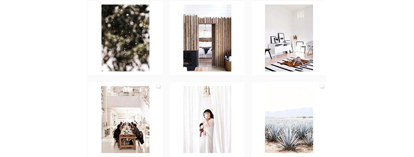
Minimalism is one of the main trends in today’s world. This trend is observed almost everywhere - from up-to-date high technology to prestigious fashion companies. The @canarygrey account uses a minimalist approach to photography. There is a lot of white, brightness, and space.
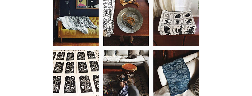
Dark + elegant
@amelimancini uses dark processing, thus emphasizing the beauty and sophistication of handmade items.
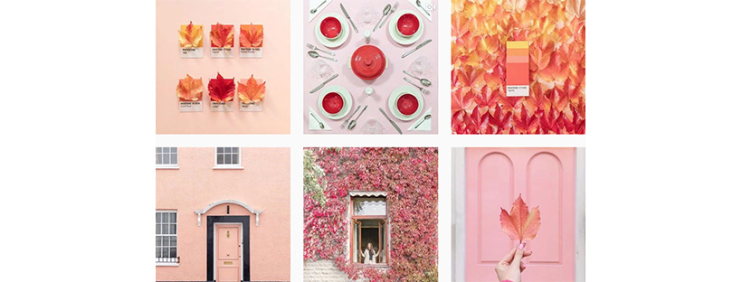
Pastel shades
@Cestmaria uses almost all of his photos with vibrant color backgrounds and calm touch.
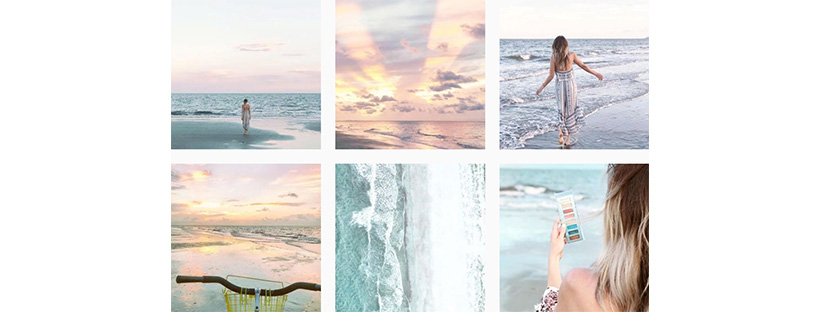
Baby pink and blue
The @noellekramer profile uses shades of coral, golden, cerulean blue. What is the result? It’s a beautiful, inspiring, and holistic acc.
Tenderness
This focus is popular with girls and young women: from schoolgirls and students to careerists. Cosmetic companies or brands use this style.
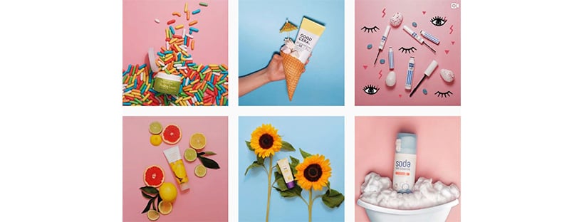
Luxury and glamor
There is a ton of opportunities to make your account glamour and chic. Regardless of the content, most glamorous photographs have rich colors and high contrast.
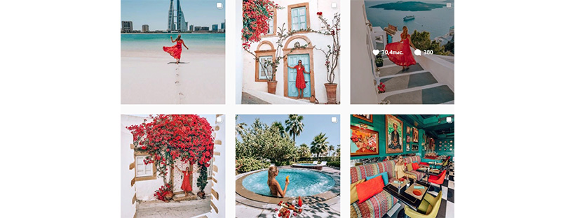
Dark shades and sensuality
Sensuality is understood as hedonistic tendencies: pleasure, aesthetics or the desire for physical satisfaction. This style is common among many brands of clothing, jewelry, and underwear. The key factor is sensory perception.
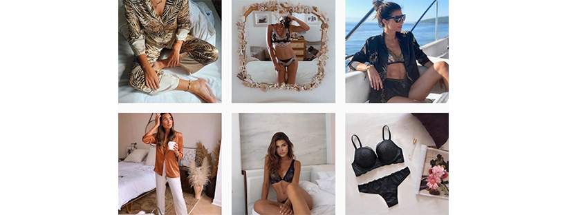
Romantic
It is flirty, intricate and full of detail. Key topics are nature, music and everyday objects. Colors can be used in bohemian aesthetics, but usually, they are not too saturated and catchy.
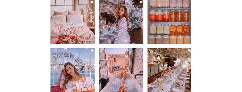
Healthy
Such accounts are characterized by vivid and positive colors, an abundance of nature and softer photo processing.
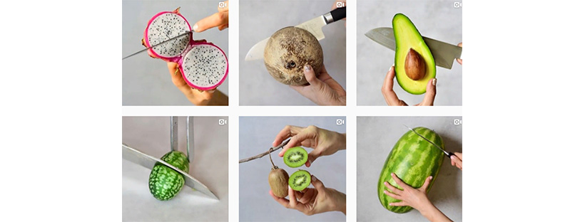
You can choose any suitable topic for your account. The main rule is to keep the general course and adhere to the chosen style. The following examples will help to understand the combination and how to approach the design of Instagram style.
Step#4. Find your colors and style
If a certain color is used in the design of your company, consider including it in your IG content. This will bring a sense of wholeness and unity of posts. It will also make you more recognizable among followers.

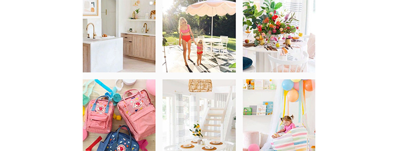
There are tons of reasons to love @sugarandcloth. However, a uniform design style immediately catches the eye. There is no specific key color. And although there is an abundance of pink, the main thing in this account is the content of the photos, accents, and sequence.
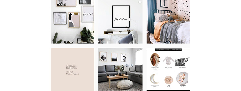
Another great example is @yorkelee_prints. Here all the photos are made in a single gamut. This requires some effort and editing. However, the result is worth it.
Choose one or two of the styles listed above. Pay attention to their description and following these characteristics, start looking for suitable content.
Your purpose is to select from one to five pictures for each category of posts. Let's say you choose minimalism and a feminine style. You have a category of home decor images. Pick up 2-5 photos on this topic and in this style. Then put the selected pics in a “grid” and they complement each other.
It will be a type of collage, the photographies in which are united by one theme. To make and evaluate photos conveniently, you can use Inflact Posting Service.
Step#5. Define content strategy
Your profile will look much more seamless and harmonious if all your content is consistent. Whatever topic you choose, make sure that all publications correspond to this topic.
An example is @christuckerphotography. Here you can find many pictures of boats and other aspects of ocean life. And even if sometimes the profile owner deviates from this topic, stylization and processing remain unchanged.
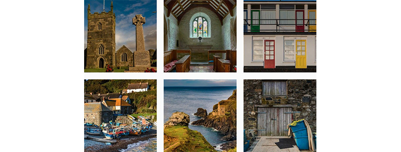
Despite the rather narrow focus, @cbre is an example. City landscapes from around the world are published here. The result is a well-organized and solid thematic gallery.
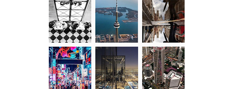
The appearance of your Instagram profile is also part of the company. To briefly highlight the main principles of graphical design.
Colors and fonts are essential. In general, there are five aspects to remember when selecting fonts.
- Is the font readable?
- Are there any similarities with other well-known logos?
- Should I use sans serif or serif font?
- How about a handwritten font or brush?
Step#6. Plan publications and follow the strategy
Whenever you publish a new image, think about how it will look with previous and next posts. Analyze and make sure that the new image fits into the picture and looks balanced.
Attention to three images simplifies the situation. This is more convenient than meticulously figuring out whether a photo matches the entire feed.
Before you click the download and publish button, you need to consider a couple of important factors:
- The colors of the last message should match the colors of the first and third photos. Or combine with them.
- If the first and third columns are loaded with details, the new photo should be simple and clean. This will balance appearance and prevent chaos.
- Don't be afraid to browse your IG regularly. And delete any pics that just don't fit. It is important to clean your IG to maintain its fresh look and flow of new ideas.
- Take a look at the selected images. They should combine well with each other and give the impression of integrity.
- To correctly create a grid of images, it is better to use special services. They will allow you to look at the general view of your acc before publishing. One such application is Inflact Posting Service. It shows how future posts will look. Whichever application you choose, it’s important to simply evaluate the look of your profile as a whole, its aesthetics and the compatibility of the images standing nearby. Do you want more about Auto-Planner? Read the articleGet Your Affairs in Order: How to Schedule Posts on Instagram? and pump your skill! Want more? Welcome to Refreshed Scheduled Posting: How to Post on Instagram Online in a New Way?
- A few words about the composition. Do not put too similar images next to it. It looks deliberate and unnatural. It’s bad when every second photography belongs to one “type”. A more spontaneous grid often looks better. However, that’s up to the individual taste of each.
As an example of "deliberation," we can cite the already mentioned The Female Hustlers is an example of "deliberation". In their profile, an alternating grid is clearly traced.
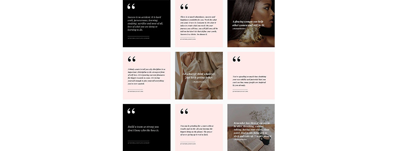
If you dilute this grid, the account will look less strict. Thus, the panel with posts should look harmonious and beautiful. Especially in the case of fashion industry companies. But then again, it is a personal preference thing.
Bump up to the ideal: how to make your Instagram good?
Congratulations, you did it!
Now you are ready to challenge yourself and run IG properly. Hope, the question “How to make your Instagram good?” is settled. You should have ready-made collections of thematic pics. All you need to do is update them every month.
Integrity and consistency in your posts attract new followers and simplify your acc management.
Kill two birds with one stone.
It’s great if this guide was helpful. Creating a beautiful wrapper for your Instagram profile is easy. You just need to think strategically and try to find the right style and theme.
If you have questions or additional tips, feel free to share them. Any comments on the material are welcome.


