Nowadays, the way your Instagram grid is laid out is one of the most decisive factors in users deciding whether to follow you or not. That means that it directly affects sales advertising contracts you will get from your profile. This issue is especially serious in the life of every person who has an Instagram business.
Over the years, various developers have created application sites to simplify and improve Instagram posting and create a beautiful mosaic, and post scheduling is one of the most important in this business…but here is an easy way to do it now.
Instagram grid planning lifehack
We realized that visual appearance and scheduling of posts can be much easier than we think, and for this, you will not need anything at all except your own iPhone. This is our life hack, which we secretly share with our readers because after we discovered it, our life can no longer be the same. This is a planning tape right in your camera roll album.
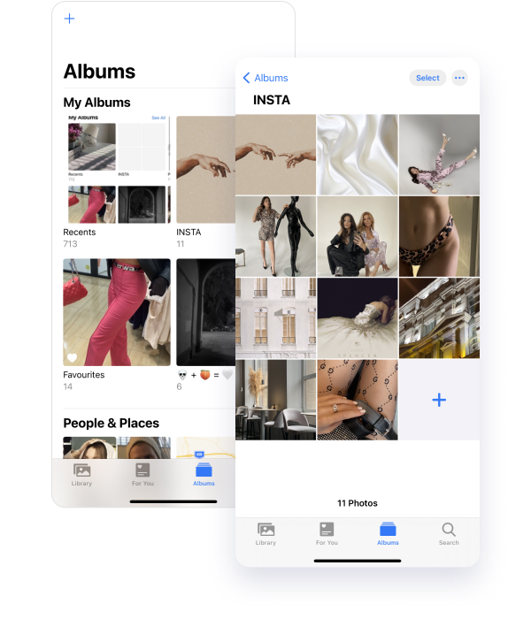
This life hack consists of only three steps and has another secret in it:
#1 The first step that you need to take in order to plan a visually pleasing Instagram feed for your subscribers is to create an album for Instagram on your iPhone in the camera roll.
#2 For the second even easier step, you just need to put into this album all the photos that you would like to see on your Instagram in the future. Just in one go mark all the photos that you will post one by one on your Instagram profile.
#3 Further, all you need to do is to move the photos away from you or zoom in so that they are of the same size as shown in the screenshot. In this size, you can move the photos to put them in the sequence that you like.

That's all! With such easy manipulations right in your iPhone without any applications, without payments, without additional sites and hassles, you can plan your feed for years to come. All you need is to have great content to post on Instagram and voila.
The coolest secret of this method is that you can go to this Instagram album on your phone and post your photos right from here. This is very convenient because there is a function in the iPhone that allows you to directly choose whether you will post a story or release an album.
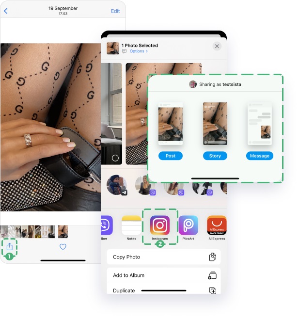
By the way, you can create a special folder for Instagram stories, which is also very convenient.
After you’ve planned your feed - add everything you’ve chosen to the posting module. And you won’t need to move - everything will be posted automatically.
Instagram grid variants
The visual structure of an account is the layout of your Instagram posts. Visual schemes help to make an Instagram account clear and harmonious.
Despite the fact that there are not many such visual structures, the choice of the Instagram grid must be planned carefully. It doesn't matter which concept you choose, but it is important to follow it to the end.
Why do you need a structure for your profile?
- The account looks beautiful, harmonious, and stylish.
- It is easy to find the information you need for new and old subscribers (prices, reviews, navigation, delivery, contacts).
- With some schemes, it is easy to plan the feed only 2-3 posts ahead.
- The structure creates trust in a blog or business on Instagram.
- An attractive and convenient account sells more, and Instagram users are more likely to subscribe to beautiful profiles.
Account structure is not always about templates. The structure can be created using your choice of photographs: color, light, composition, color spots.
The layout of posts on Instagram in a column
It's simple. Select useful and high-selling posts in separate columns, and everything else in the third column. To get a good account, just publish every third picture in the style of the column in which it is located.
For the most understandable and simple structure, there can be one, two, or three columns. The posts do not move out anywhere; the columns simply move from left to right. Everything is clear and understandable.
Do not repeat monotonous photos in columns – it looks boring.

The layout of posts on Instagram in a checkerboard pattern
Checkers or chess is one of the simplest schemes. It is enough to alternate the layout of posts through one.
You can alternate according to the principle of contrast:
- Light and dark.
- Black and white, or contrasting colors.
- Templates and simple photos.
- Product photos and informational posts.
- Color spots and gray background.
- Faces, landscapes, and more.
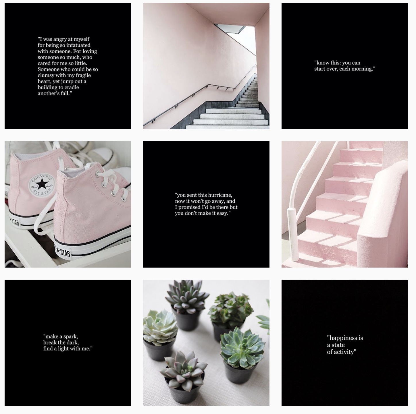
The chess scheme has many advantages:
- It is not necessary to write a content plan. It is enough to plan 2-3 posts in advance.
- You don't need to have special skills, you just need to publish posts one by one.
- It is an ideal solution for business accounts because It is easy for subscribers to find the information they need, provided that the information posts are correctly placed.
- Such a scheme sets the rhythm and attracts attention. Everything is clear and understandable.
- Suitable for all accounts: blogs, shops, coaches, services, etc.
Diagonal arrangement of posts on Instagram
A very interesting scheme. With this scheme, the eyes of visitors can be taken in the right direction (for example, to information posts). This pattern sets a good rhythm.
Diagonally, you can lay out both templates and photographs by color or color spots in the photo. You can also lay out the subjects of photos (for example, landscapes or portraits) diagonally.
The layout of posts on Instagram horizontally
The scheme is the same as in the "column" scheme. The disadvantage is that you need to upload posts three at a time.

It is important to plan your feed in advance. The appearance of the Instagram mosaic greatly affects how users react to your account – whether they are inspired by the photos, whether it will be convenient for them to search for your posts, and whether all the products that you sell on Instagram will be presented correctly in your feed so that users want to buy from you. Now an Instagram profile is not just a social page, it is a full-fledged site that can bring you a lot of customers and become a full-fledged business for you.


