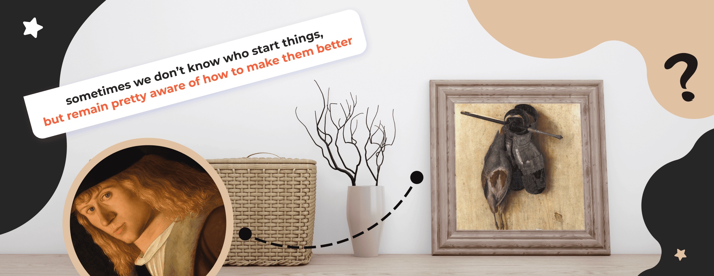
Having once depicted a partridge, a plate gauntlet, and a crossbow bolt on canvas, Jacopo de’ Barbari hardly expected to mark the beginning of a new genre of fine art. He is for sure a good example of how to carve your name in history. Yet, not everyone is lucky with recognition. We can’t track who first came up with laying things on a horizontal surface and then filming them from above. But what we do know is that the sixteenth-century “Munich Still Life” has been reborn as Flat-lay and is dominating our feeds.
Since top-down photography is a long-living IG trend, those with a big background are rightfully getting their share of shout outs. So, we suggest unpacking the secret of an amazing flat-lay.
But first, let's dive into the other benefits beyond the unusual shooting angle.
Why Opting for a Flat-lay Instead of a Conventional Photo
Beyond the obvious expansion of the platform's visual horizons, the new approach provides practical benefits to content creators as a means to:
cover the topic to the full or almost near. Regular photo styling is mostly capable of forming one lasting association, while a flat-lay has unlimited potential. Thus, you can relay your thoughts and introduce the idea of a post or a Reel right from the start. By doing so, you need less hooks to grab the user's attention.
Take these two posts to see the difference.
Both images explore a travel topic. So, the first semantic layer is clearly fulfilled. If digging deeper, the flat-lay gives room for more mental transitions. We can guess it must be some hiking tips, and the way items are grouped a packing list is likely to be provided. A smiling girl seems not enough for such conclusions.
That is, due to multiple associations, you immediately narrow the topic, and thereby generate a higher-quality target audience.
spread vibes. In fact, any photo gets this covered. Again, this particular format allows telling the whole story with just one shot. In other words, instead of posting a carousel to narrate as you see it, one post is enough. Sheer is amazing, isn't it?
advertise your product. Since flat-lays happen to shift the focus from the plot to the details, it is a real lifesaver for brands. This is especially true for complex niches where staged photos are not always able to convey a clear advertising message.
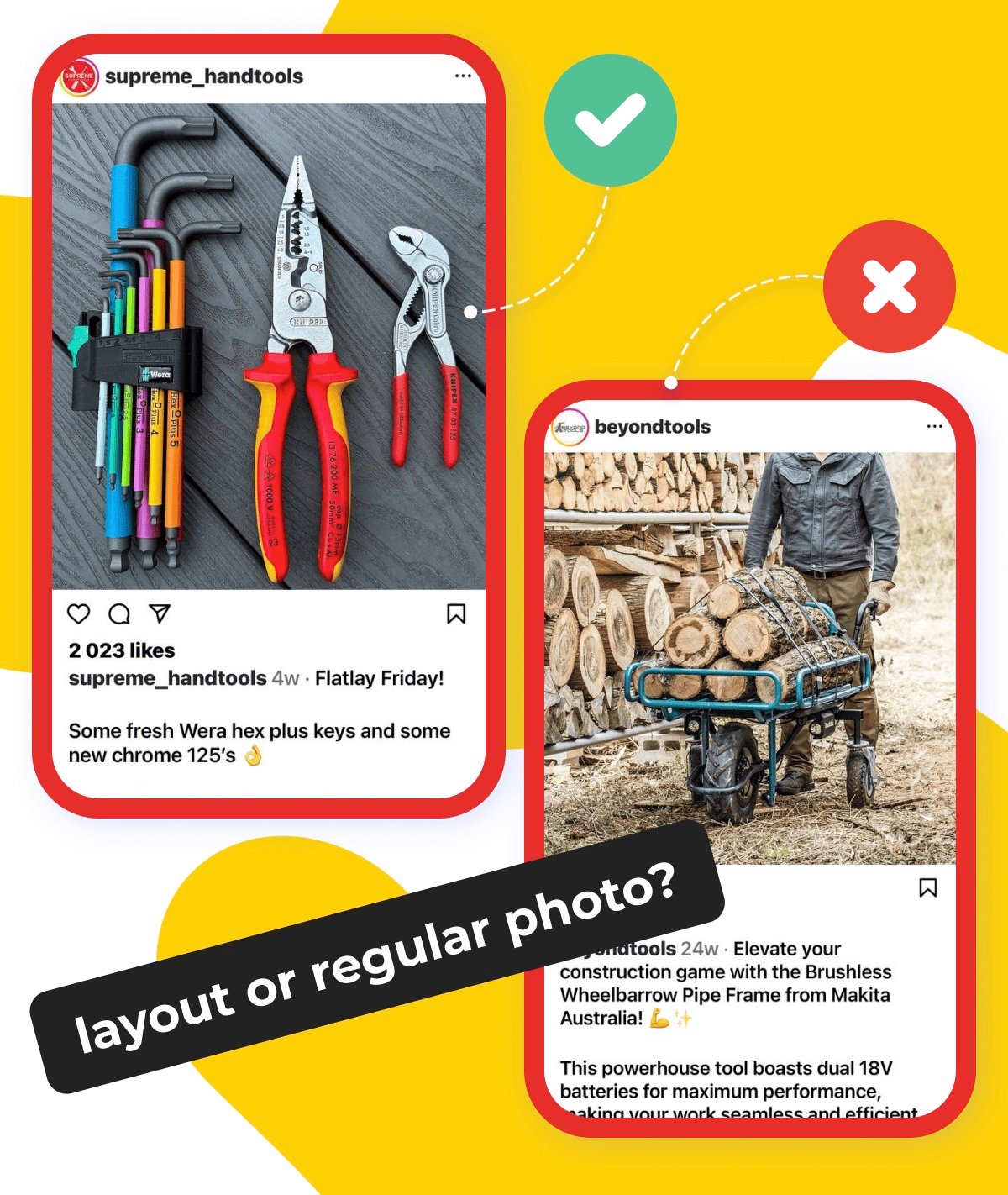
Take a look at these pics from two different hardware stores and decide which one presents goods better.
The answer is ON the surface!
Bird’s-eye perspective photos are not only an artistic technique, but also a thoughtful marketing ploy that generates the right target audience, increases the level of engagement, and also sells well.
Where to Find Inspiration for Your Future Masterpieces
There are self-directed creators. One wave of the hand is all they need to get an Instagram-worthy shot out of an awkward product set. Still, those who do not have natural abilities should not be discouraged. Look for good samples as a starting point, and then a flight of fancy or most likely no identical props in stock will save you from mediocre copying.
First things first, make the most of Instagram's search capabilities. Hashtags must help you along the way. Opt for the following ones to find what you need:
#flatlay #instaphoto #instafood #flatlays #photoeveryday #lifestyle #instadaily #photooftheday #beautyphotography #pinterestinspired #trending #redaethetics #booksgram #instalike #enjoythemoment #aethetically #cozyhome #myeverydaymagic #beigemood #details #minimalfeed
After some relevant posts are detected, go to the author's page for more insights. Don’t hesitate to subscribe if the material published relates to what you want to convey with your own works. There is nothing wrong with admiring a talent. Be attentive to all content on the page including Reels and Stories. They most often contain useful tips or hidden gems from the “unreleased”. However, if Reels take bookmarking, so that you can look through them later, you should download a Story to do the same. The Instagram Story Viewer by Inflact will get things covered for you.
We believe you won’t embark on it, but just in case, avoid repost behavior.
You must have not only discovered how to save a photo from Instagram. Those who carefully examined the hashtags need no prompts to check out Pinterest for ideas. Well, it is another smart move.
Don't count out online retailers. Since flat-lays are an advertising panacea, these guys are a treasure trove of good designs, themes, and compositions.
But, it is still you who are responsible for what the final result will be.
So let's go over some basics.
Learn Key Principles to Make Your Flat-lay Stand Out
You must have noticed an eye-catching effect of flat-lays. Even though it is the most ordinary stuff, one can spend far more time on going into details than engaging with an average photo. It is the harmony of the composition that makes everything work. To invite aesthetic pleasure, creators should consider the number of objects, the way they are arranged in space and relative to each other, color matching, and more.
Sometimes beauty comes out of chaos like Venus’ birth experience. Still, we strive for order and comprehension. Taking philosophical thoughts out of the equation, make sure that you:
1. Cling to the rule of the “golden ratio”.
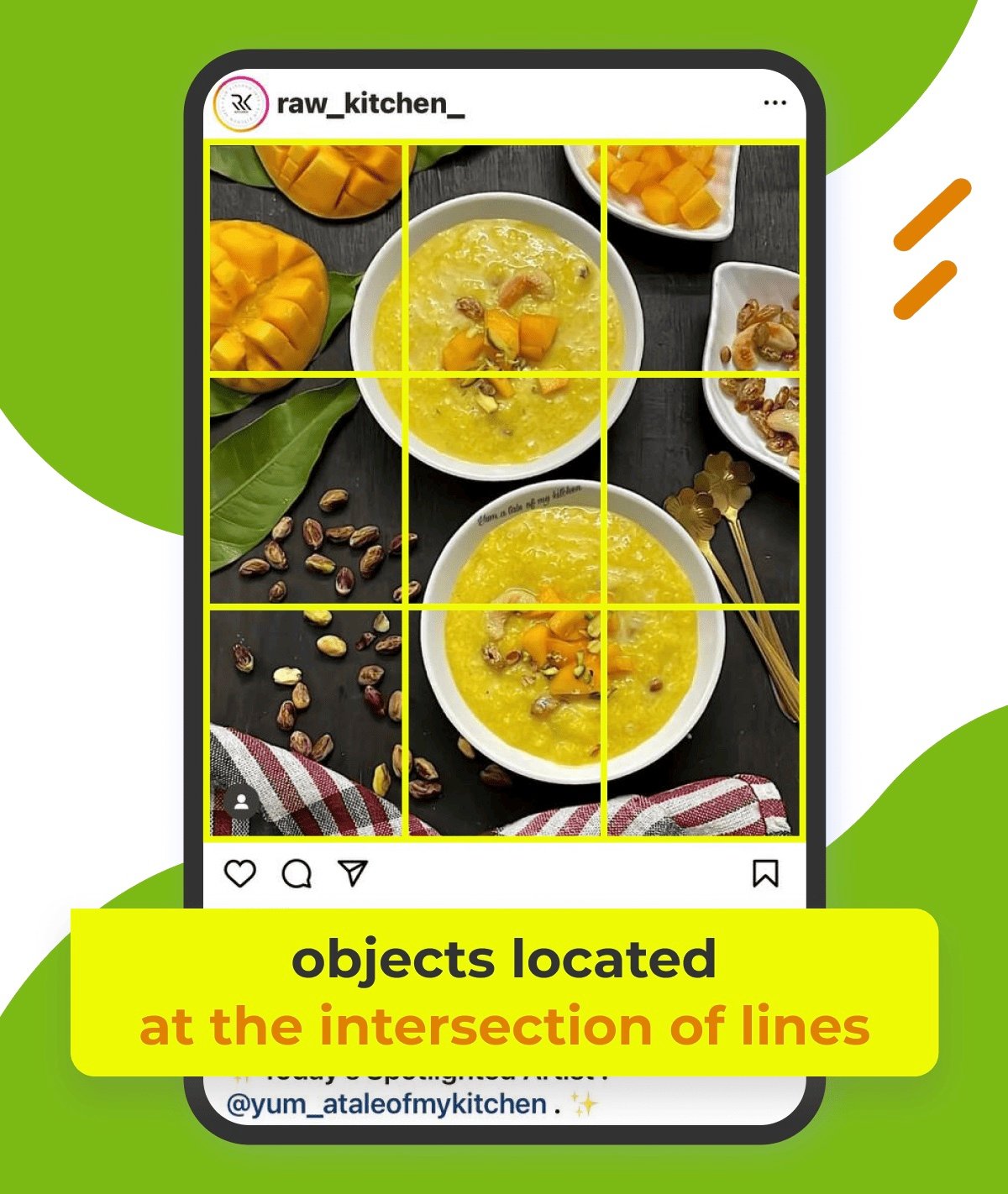
The concept is simple here. Mentally draw three equidistant horizontal and vertical lines, and then place the main objects at their intersection. These are basically the spots our eyes fix first when interacting with the image, and, therefore, they are responsible for the overall visual perception.
A mango pudding hands down glues the viewer and is the main focus of the composition. So, after the photo is out of your sight, you are unlikely to remember anything else other than the dish itself.
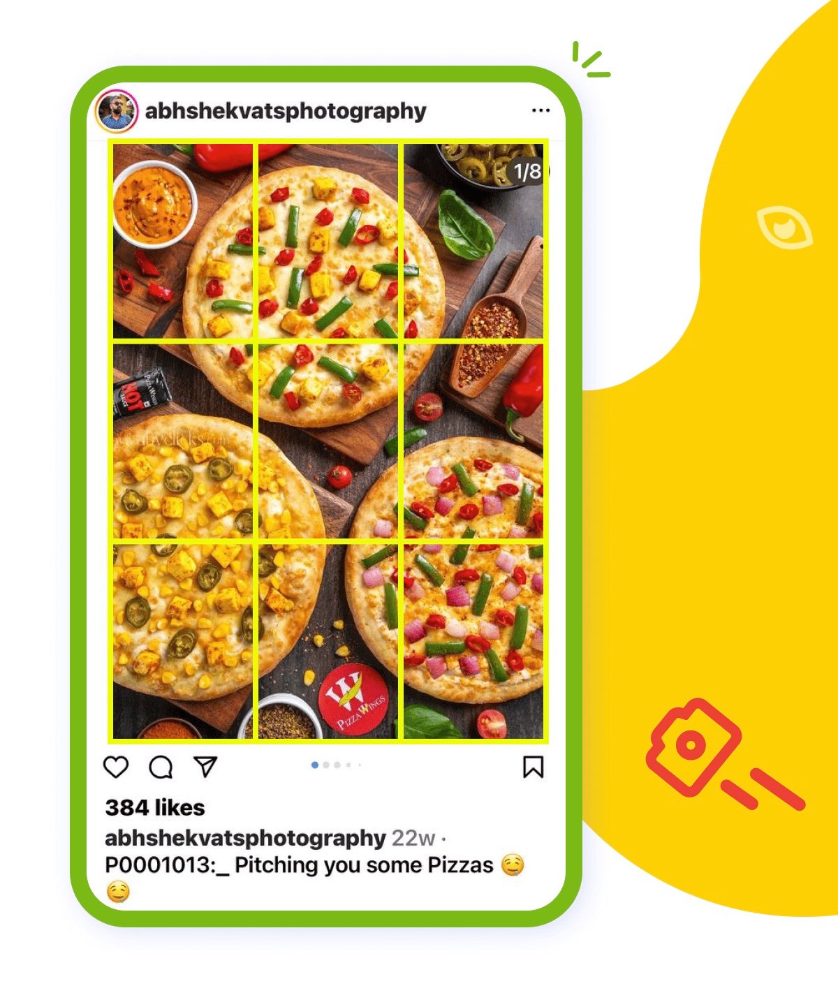
You shouldn’t fill all the resulting positions. The more intersections you take, the more user attention wanders. Given that, making the most of it can become a problem. This is especially true for an advertising collage, which is supposed to demonstrate a specific product.
See how it is almost impossible to hook on any particular pizza.
2. Name the main subject(s).
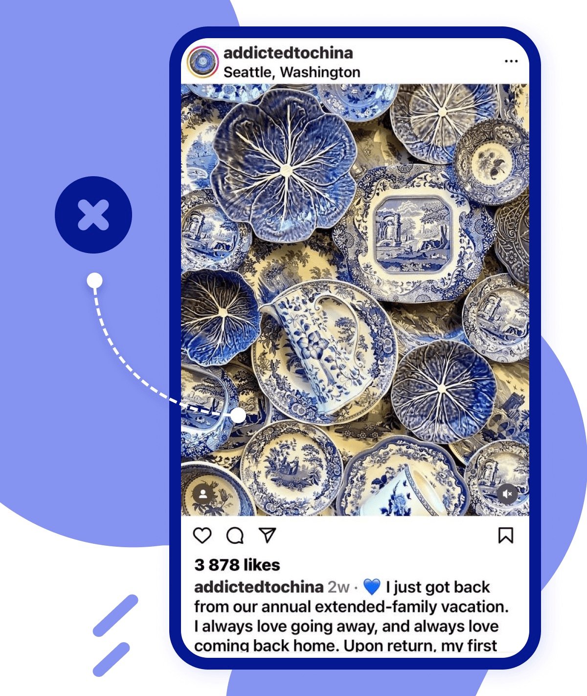
There may be one or several central items, but if they are not in the frame at all, then we will just get a motley canvas that looks more like a background rather than a full-fledged frame, as, say, in this case.
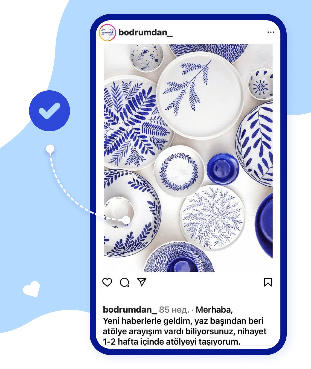
Compare with the following. Large ceramic dishes are an accent group, and smaller bowls serve as decoration and do not steal the view. Another point is that the background is not overloaded, which gives the image an airiness and brings objects to the fore.
Good pictures take items that fit into the story, adding context to the main subject, but not distracting from it. Arrange small props so that the frame looks balanced without unnecessary noise. There are several basic layouts.
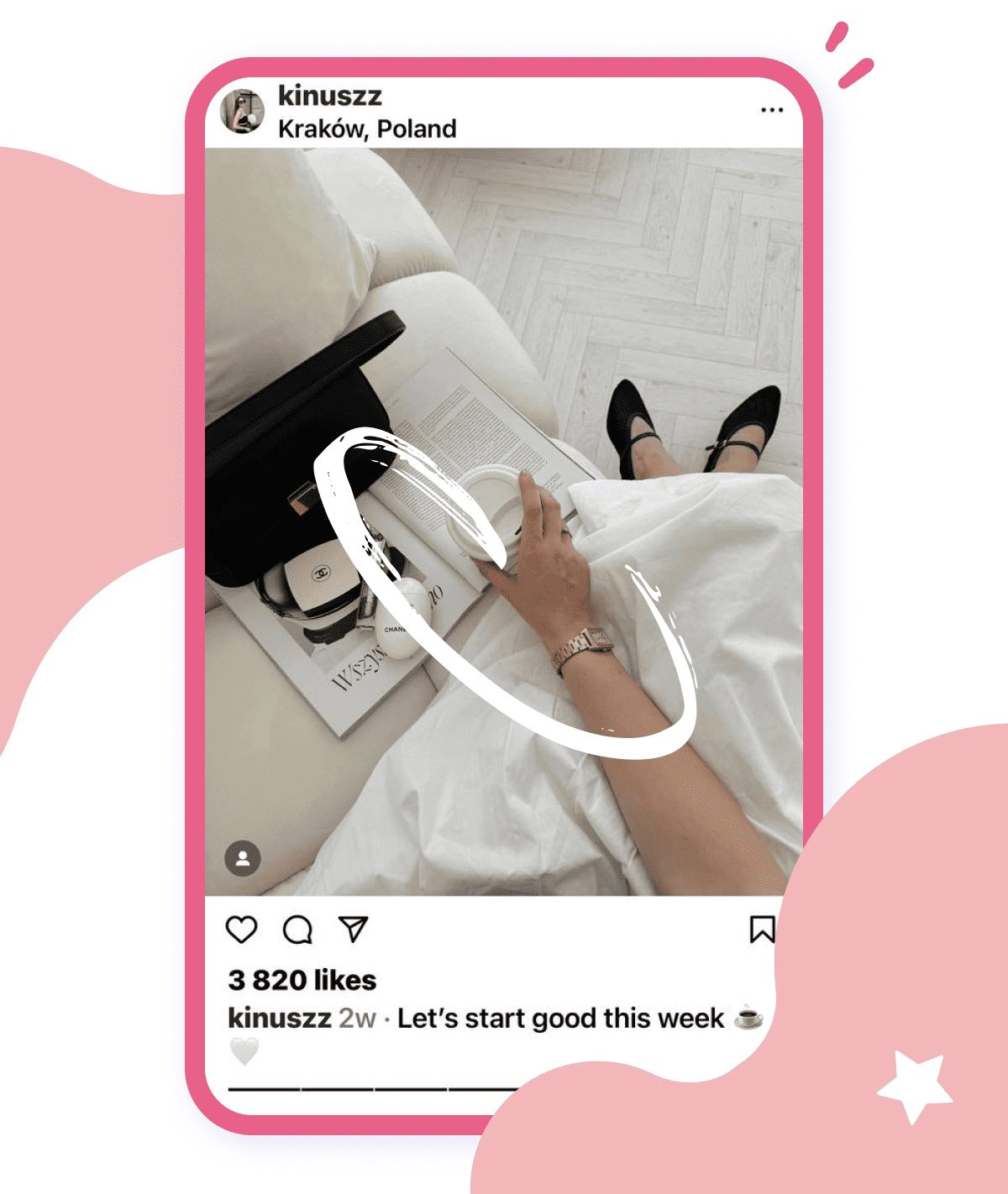
C – shape is the most popular way to compose objects. Arrange all you have in a semicircle and leave the center untouched. By doing so you leave yourself good spacing for text inserts.
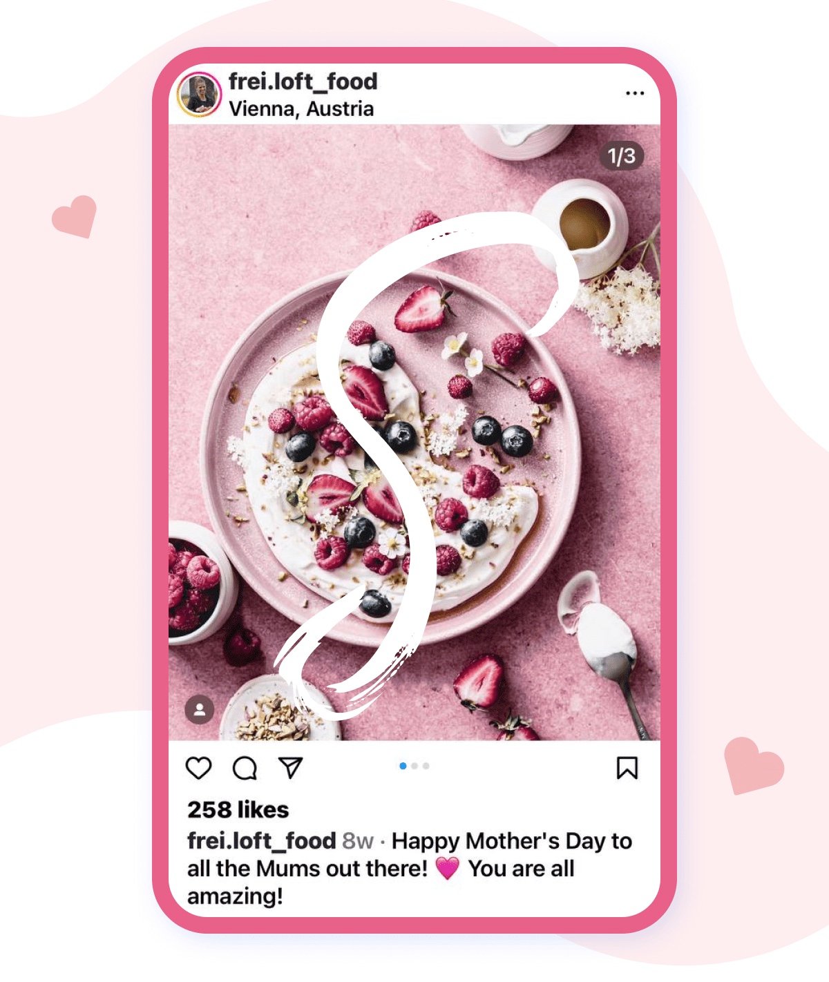
Or try a S-letter approach to cover the background to the full:
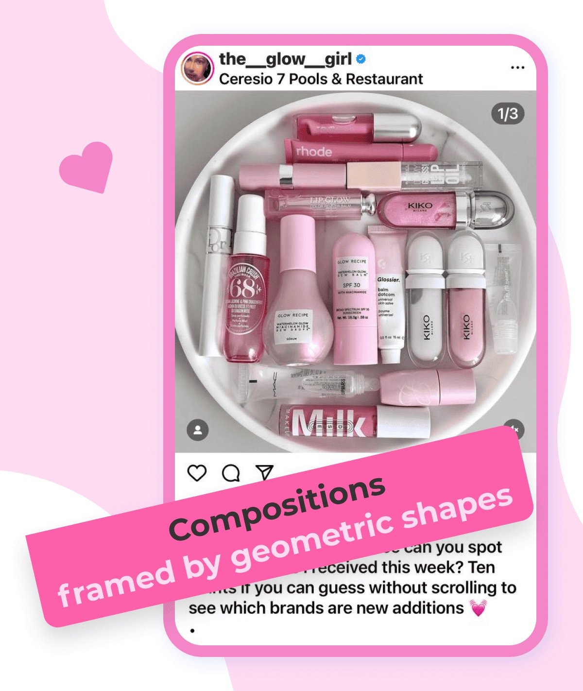
Geometric compositions also top the list. You can either shape objects accordingly or use props to create clean lines, like in this photo:
Speaking of props, it may be enough just to ensure that the elements fit nicely into the color scheme or match the proportions. Identify commonalities with the main item, such as a good combination of the gold bottle cap and popcorn shades below.
3. Apply tried-and-tested colour schemes.
We have little control over color combinations in regular photography. But we can unleash the potential out of the layout by diving into some theory of how to deal with the pallet correctly.
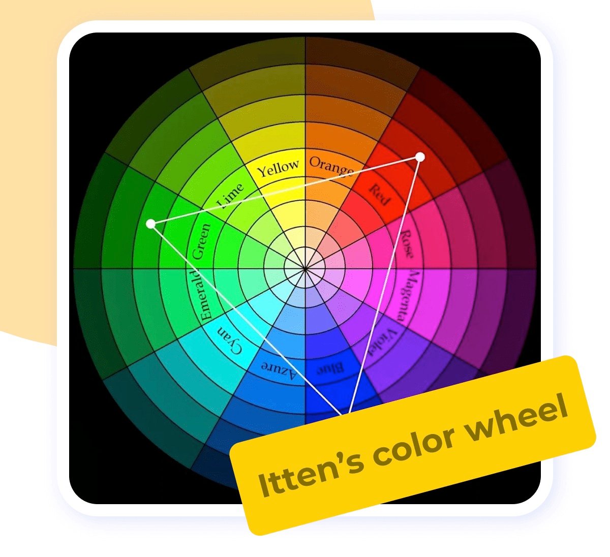
To catch the gist, you will need to check Itten’s color wheel from time to time. So don't hesitate to scroll up.
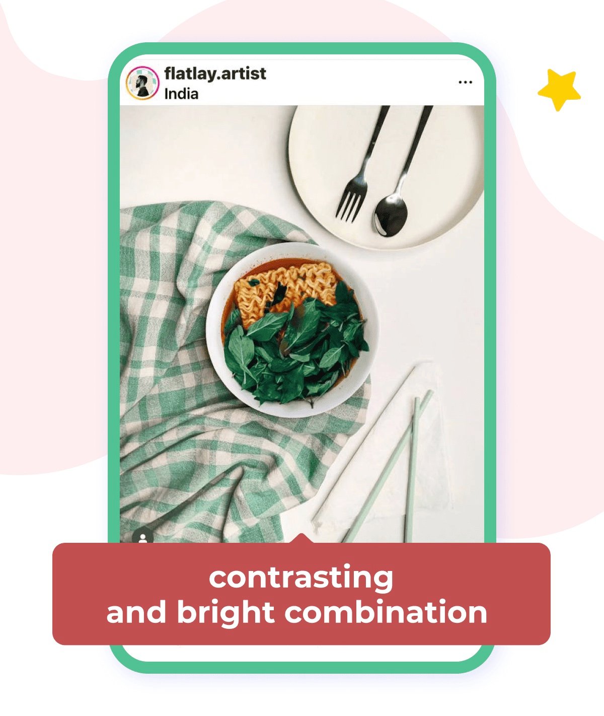
A complementary Colour Scheme is a contrasting and bright combination, as well as the most common and well-known scheme. It is made up of two colours that are opposite each other on the circle, such as red and green.
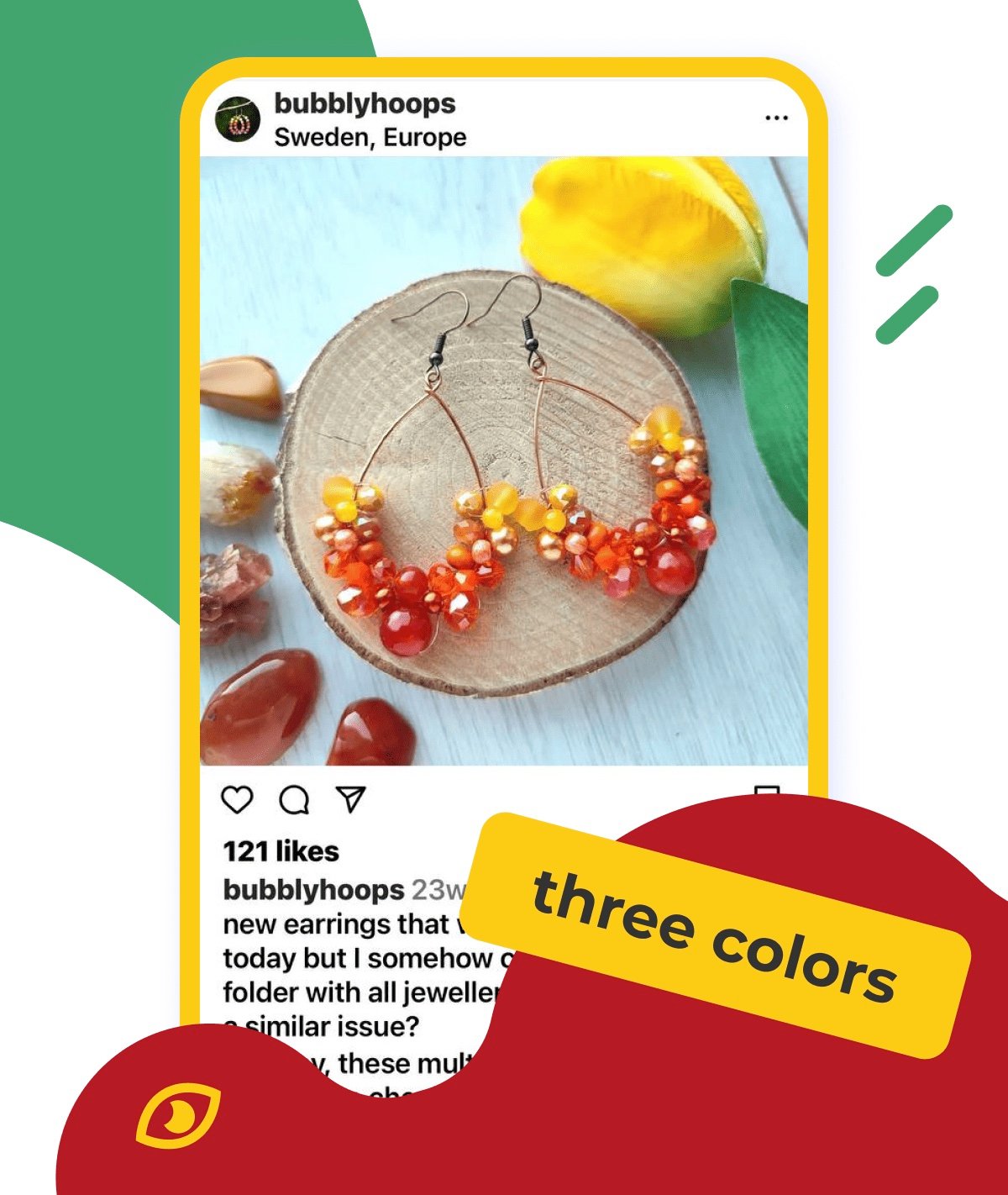
A Triadic one is formed by three colours at the ends of an equilateral triangle. Most often, one colour is the leading one, and the other two are used to add up to it.
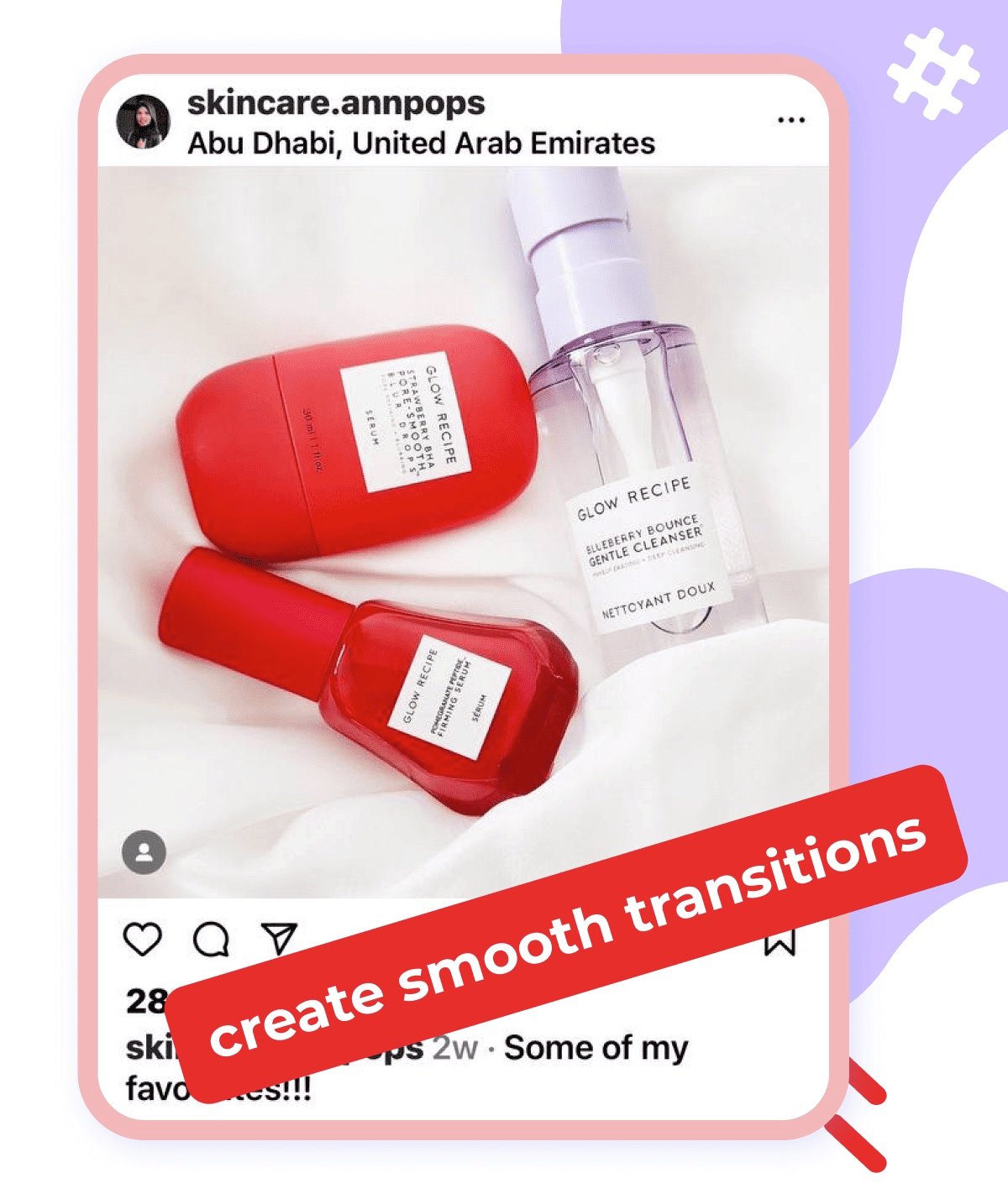
An analogous Colour Scheme consists of 2-3 adjacent colours on a circle. Such multiple colour combinations are considered quite calm since the colours do not contrast with each other which creates smooth transitions.
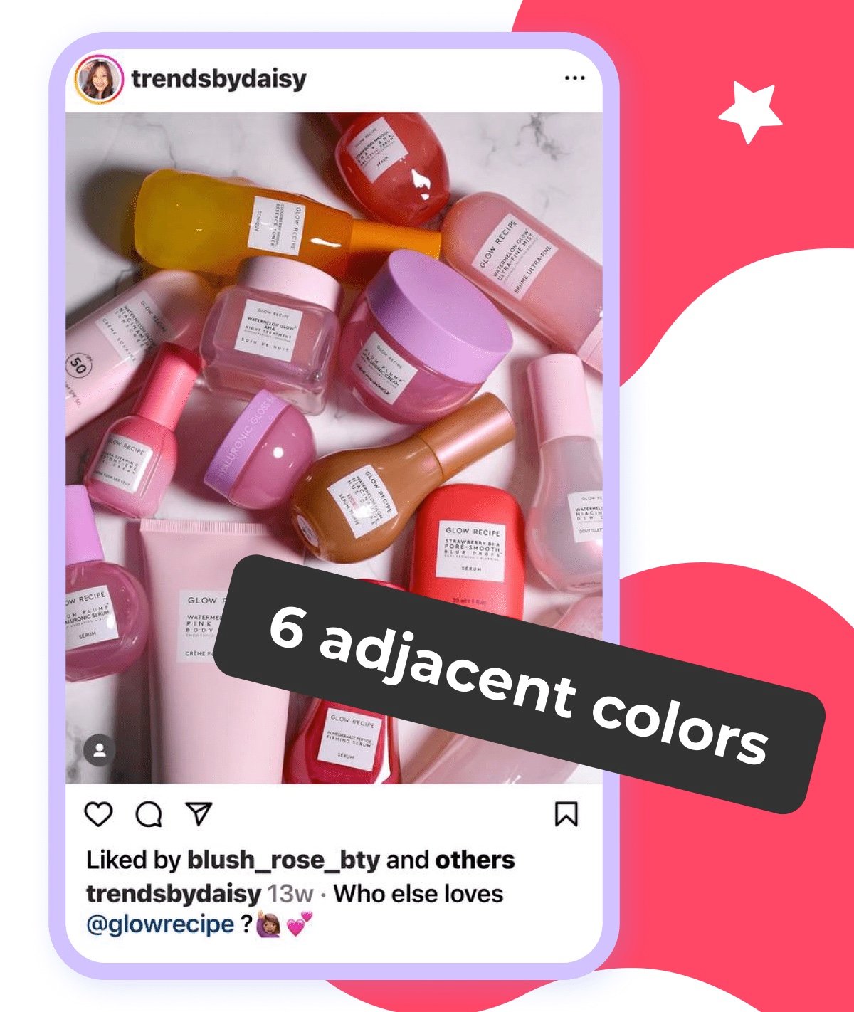
There is also a more advanced version of up to 6 adjacent colours on a circle.
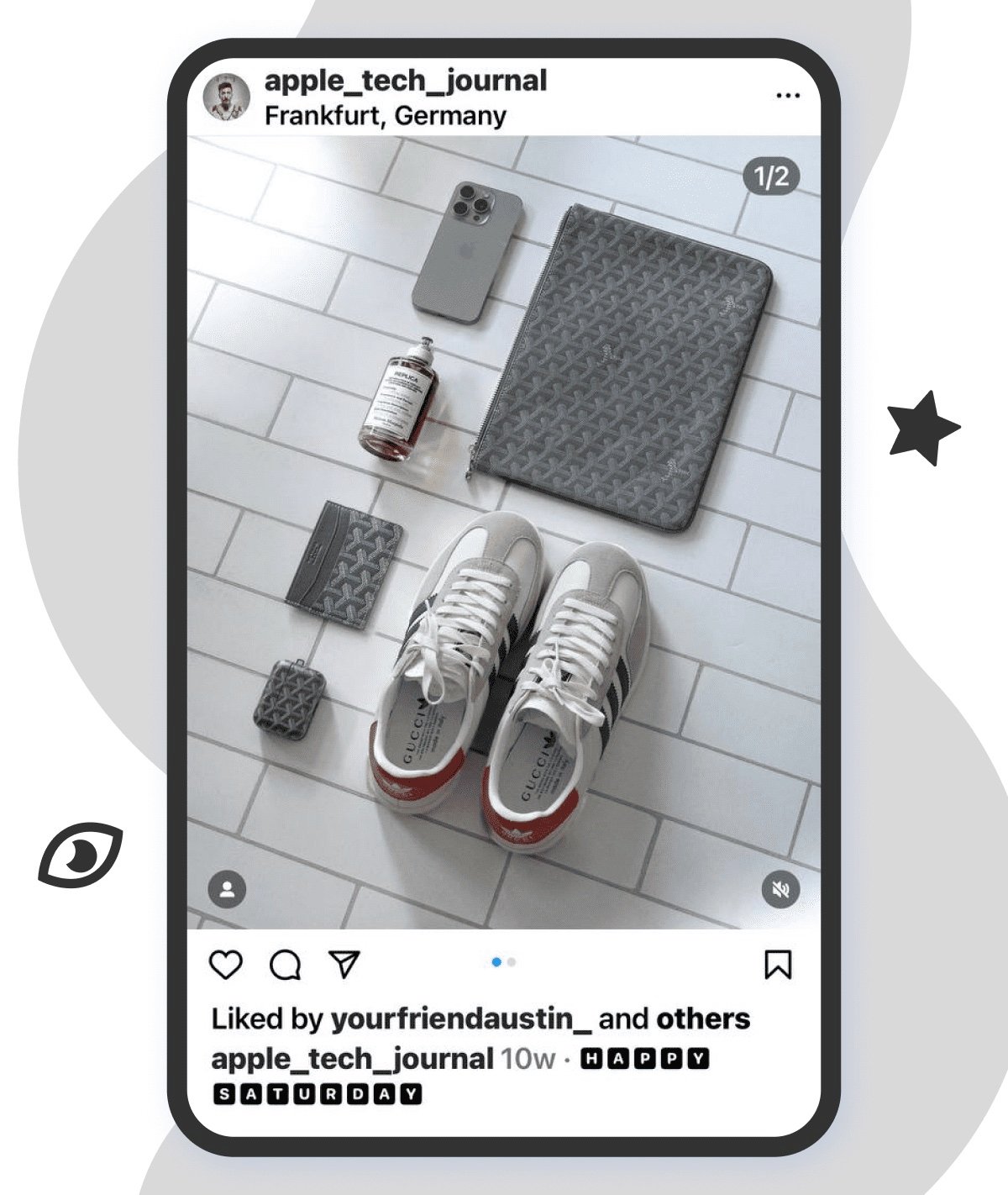
A monochromatic combo, which is the simplest way to style flat-lays, involves opting for only one colour. You should adjust shades to make the photo vibrant. It is the most popular approach to meet Instagram aesthetics since such photos are easy to fit into the feed unlike their saturated brothers.
So, all three points are followed to the tee, but let’s face the music the result leaves much to be desired.
How to Save Your Flat-lay Using a Photo Editor
This does not necessarily imply that you need to start from scratch. Correct shortcomings and bring your photo to perfection in any photo editor, from on-everyone-lips Photoshop to the first application you come across in the AppStore.
So, what can go wrong, and how to fix it?
1. Replace the background
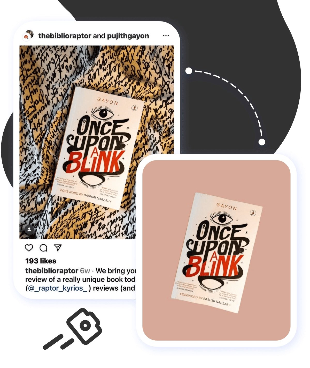
It should be remembered that the more color the subject has, the more neutral the background should be. Choose a background so that, on the one hand, it looks organically together with the props and, on the other, does not draw attention to itself, as happened here.
You won't need a Masters degree to know how to change background colour on Instagram Story or post. To enhance any frame, cut out the image and download an appropriate template.We got it done in the Bazaart photo editor, but you are clearly free to use any.
2.Work with lighting
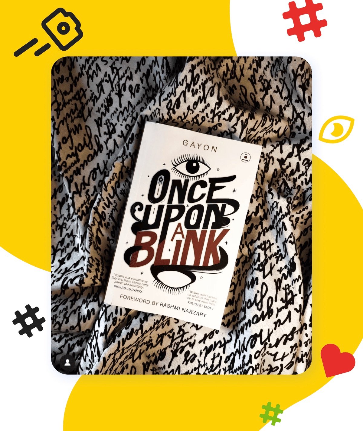
Artificial lighting always loses to a natural one. But even when shooting without a light lamp and at the right time (morning hours until 12 and 2 hours before sunset), there is still a chance of getting a backlit or, on the contrary, too dark frame. Lightroom has proven itself quite well for improving sources, but again, you can use any software convenient for you, since this is a default function for the majority alike.
We have turned to the Instagram photo downloader by Inflact to move forward and adjust the initial book flat-lay.
3. Remove unnecessary things
If your original photo is far from perfect, try cropping the frame. We like Photoshop's Crop tool. It lets you reconstruct part of a cropped image to find the best frame borders. So to say, the same principle works when editing an image on an iPhone.
Yet, IOS features are clearly not enough to remove unnecessary objects from an already-designed frame. Be blessed Photoshop. Start the Lasso Tool, then go to the Edit section and pick the Fill option. Set the Content-Aware setting and click OK to fulfill the process.
Same result can be achieved through the Patch Tool or Clone Stamp Tool. Yet, these tools are not suitable in all cases and are relevant for advanced users, since they require preparatory work with layers
By the way, the mask function in CapCut fits for removing unwanted objects.
To Bottom-Line
Practice makes perfect. You can go over endless guides on how to do things as much as you want. But until you give it a shot better forget about making it. So, don't let uncertainty get the better of you. You're ready to make your first flat-lay! No time to act as a watcher, get this show on the road!
